CLYW is a Canadian brand that started in 2006. I was 14 at the time when I watched this new brand unfold on the Yoyonation forums. They released their first yoyo named the "Peak" with 50 pieces retailing for $85. Today, that yoyo has used asking prices north of $2500 making it one of the most insanely rare and expensive yoyos to date. This "OG Painted Peak" featured a custom painted surface by a Canadian airbrush artist named Levi. Overtime as the Peak was impacted or dinged, the paint would chip off meaning there are only a handful of units in the world that survived in mint unused condition. Later versions would be released in more durable anodized finishes, but these first 50 "OG Painted Peaks"cemented CLYW into yoyoing history.
I give this context because more than one modern yoyoer has come up to me asking "so whats the deal with the Peak?". I often forget how small the yoyo community was back then, so this history that us old school nerds might consider common knowledge has become a bit of an artifact. Earlier this year though, CLYW reached out to reimagine this Peak after hearing about Luftverk's Injection Machining project. I had spent the last two years investing into a new technology to make plastic yoyos. When the Luftverk Plastic Fulvia dropped, to my surprise both Steve and Chris from CLYW bought a set of them. It wasn't long until CLYW and I started working on a plastic version of that iconic Peak. It conveniently lined up with a bunch of my other plastic projects so I thought i'd simply whip up a design and throw that in with the rest of the prototypes - not knowing how much of a nightmare this design would become.
The Design Challenge - Reimagining a CLYW Icon
Reimagining an iconic product is infinitely harder than making a new yoyo design from scratch. As mentioned above, I had the pleasure of watching the original Peak drop on Yoyonation, so it was kind of a moral obligation to keep the proportions and feeling of this design right. But almost immediately the difficulties started. Within the first day of designing I noticed that the plastic blank I had engineered to cover all yoyo designs was designed for yoyos that did not have a large raised nipple area. It didn't make sense to have a nipple since the captive nut was so small - so to optimize for cost, I made sure to make that area as flat as possible to reduce machining time. But with the Peak it would look very weird with a flat hub. I thought about canceling the project since I questioned if this was even possible due to structural integrity of the plastic. The worst part was I didn't even have other yoyos to reference wall thicknesses since how I make these plastic yoyos really is uncharted territory. For my first prototype, I measured the nipple and hub area on both an OG Peak and the Luftverk titanium Peak insuring they would be as similar as possible but changing the height to almost one third of the original height as per the Injection-Machining blank limitations - unknowingly making a massive mistake in proportions.
I attempted to keep the hub proportions exactly like the OG Peak, but I had to expand all the other dimensions to avoid the edge looking ultra chunky - with a thicker rim and smaller diameter the renders didn't look like a Peak at all. Also, moving a design from the much denser aluminum to plastic meant that there was more material volume that was needed to make it the correct weight. I talked about this briefly during the design of the titanium peak, which had the opposite problem with titanium being more dense than aluminum. I found even more problems when working on the pad design. The blank has a 19mm sized pad injected right into it - but using this pad size didn't look or feel "CLYW" like. Again - the Injection Machining blank was never designed to do something remotely close to this. I started researching if it was possible to just machine away the groove to accept bigger pads, even if it added to the overall cost of the yoyo.
The plastic area measured very thin with the added depth of the Snow Tire groove and I was concerned about durability issues. So as a backup plan, I submitted two prototypes - one with CLYW type Snow Tires and one with much thinner PF20.6 pad I developed for my aluminum brand Polyform. This new pad has a snappy feel and larger surface area much like the CLYW pads. My plan was to see if the durability of the deep groove CLYW pad was enough, and if not we could use the PF20.6 pad instead as a back up. This obsession to avoid using a standard 19mm pad wasn't anything other then to preserve the feel and apperance of the OG Peak.
Upon receiving the first prototypes as shown above, it was obvious it needed work. Aesthetically, I made the diameter much larger than the OG peak to avoid the rim looking way too chunky. But the larger diameter made the nipple and hub features look super tiny. You can see this mistake in Prototype V1. I didn't think to scale up the hub features at all. In the renders, the hub features looked so prominent but when receiving the actual prototypes it looked underwhelmingly flat. The photos don't really do it justice how weird these few initial protos looked lol. The hub just didn't look "Peak like". Luckily, the deeper Snow Tire groove actually held up amazing - I had even asked Steve to give it the ol' 5A beater test. I was thrilled that the CLYW Snow Tire prototype worked out super well - and Steve preferring to use CLYW specific parts made much more sense. All this was definitely pushing the limits of what this mold can do though.
The CLYW Nipple Issues
The issue now was trying to revise the design - since the original design already nearly maxed out the mold proportions. I pushed the factory to allow me to get within 0.4mm of the maximum hub height. I also changed the hub features to be much more aggressive - not trusting the renderings as much but rather increasing the measured depths of the original Peak and enlarging the ridge details even more. During the third and fourth rounds of prototyping - it started getting closer to what I envisioned. I used tricks like slightly angling the vertical lines to create an illusion of a deeper hub and taller nipple. I realized certain features allowed me to play with shadows to give the illusion of depth. I added a tapered edge to avoid that overly chunky look - making it look much more like the OG Peak. You can really see this in the photo above of how the final design turned out compared to the initial prototypes, with the height of the nipple as high as the mold would allow. The hub details also look much more prominent with harder lines controlling where shadows and highlights are displayed - something I have never to this day had to consider in a yoyo design.
Theres something so iconic about the original Peak that when you see one it makes you feel some deeply rooted nostalgia. Like many, I was one of those who obsessed about owning one and of course bought, collected and sold a few in that golden era of yoyo collecting. It took 11 CAD file versions until the production units you see here were born. I wanted it to look unquestionably the most like an OG Peak. While many yoyos Luftverk release usually have a much more tangible technical challenge, this felt more like sculpting something that had to convey the same nostalgic feeling as the original - a challenge that had an overwhelmingly artistic element to it. It felt infinitely harder then just coming up with a brand new design - perhaps also the sense of responsibility to not let down the community this yoyo represents.
An Oversized Peak - Floaty and Fun
The play of this yoyo is definitely addicting - and this part I admit is more of an accident. I had focused so obsessively on the look of the yoyo that the play characteristic actually became a bit secondary. I had gotten the initial prototype with the weight all wrong, but since I had so many prototypes to refine the design I started to focused on a more floaty stable feel near the end of the design process - akin to the Triple Zero. With it's larger highwall design I could focus on making the yoyo much more fun and bouncy. the rounder edges also make it super comfortable in the hand, which helps as I know some people who will pick up a plastic might be a beginner. The larger diameter made it more stable even though it feels light on string. The higher walls does make it slightly easier to tilt, but the overwhelmingly positive feedback I received from many players including Steve himself made me much more confident in the final feel of the yoyo.
Color Decisions & Hub Graphics
The next aspect I wanted to focus on was that iconic double peak logo. I originally told Steve I would use the same logo design as the titanium Peak. It worked well on the titanium counterpart, but It had slipped my mind that the design was laser engraved onto the surface - not pad printed. I wanted that contrast of the logo to pop out in color. I had done laser engraving on plastic before, so I knew the laser engraving could only turn out grey on polycarbonate. That projection of the two peaks were so iconic but it felt wrong if I couldn't do it in that bright blue color. I thought the easiest solution was to print the logo directly on the curved surface but the factory claimed it would not be possible to print something like that, especially with the blue fade. I had week long emails back and fourth seeing if there was some sort of fixture or design change we could do to print that logo on with no avail. It literally was a case of "back to the drawing board". Frustratingly, their limitations of printing on a mostly flat surface meant that I could only print on the highwall portion of the yoyo. I actually came to the conclusion that we would leave the yoyo blank. But I brainstormed a few ideas, and a month or two later a slightly more subtle ring logo that complemented the white pads was developed - something that is hidden unless you open the yoyo up. I felt this design queue was a much better solution then just leaving it totally blank and it also respectively preserves the allure of the original Painted Peak.
Me and Steve hopped on a call and ended up deciding on three initial run colors - A white and blue to compliment the original peak and an Orange that actually turned out a bit more caramel after the first prototype color samples. It added really nice contrast to the blue, and made the white CLYW Snow Tire pads and white ring logo pop out, as seen by the photos. I had stayed with Alec Campbell in December for a New York yoyo event, and he had this beautiful first run orange/peach coloured peak that had a very mid-century modern feel to it - much like this caramel orange. It definitely isn't the exact same shade but the inspiration of a more mature colorway was maybe the concept I was inspired by. Because of this, I went with the more subtle orange that was offered in the first sample then our original brighter orange pantone. It has slowly been my go to color when using now, but of course I still expect the iconic blue or white to be the more popular choice.
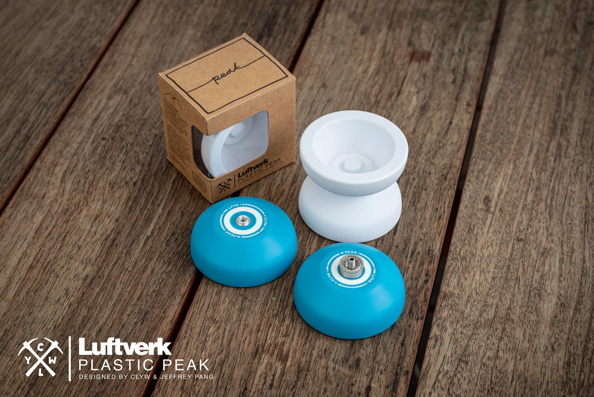
Packaging - Playing with Perspectives
For the packaging - I used the original Plastic Fulvia box design but I wanted to include something a bit more creative since CLYW was known for its home brew feeling packaging. Since the box had a similar proportion to the original Peak box, I had an idea to create a little hidden easter egg where the front side would show a modern Luftverk x CLYW design and description but if you angled the box as a specific orientation it would photograph exactly like the original Peak box. This was due to how the window of the box only wraps around on one side, and has a large blank surface on the back. I had to move the description to the one side of the box to make it work well and I think its one of those creative touches that adds to the story of this yoyo if you know where to look.
Summary - A Love Letter To The Community
The CLYW Peak has always been something that represented an era of yoyoing that is close to my heart. There was a level of intimacy among everyone back then maybe due to the size of the community or the lack of social media. Watching CLYW release the OG painted Peak on Yoyonation was something I will never forget. There was something so pure about our excitement for this simple toy, sitting at the edge of our seats waiting for the next forum update. Maybe the effort I put into this rebirth is a representation of the appreciation of how the CLYW brand affected me as a kid back in the day. My goal of this project is to bring that same excitement to the new generation who might not know what the Peak meant to us. It excites me that some people still remember this legendary yoyo, and that I have the opportunity to contribute to its story - I think if 14 year old Jeff could see this now he wouldn't know what to say.
Hope you are all keeping well.
I have a question about the plastic peak yoyo, can you change the bearing to make it unresponsive? ( sorry if this is a silly question, I’m new to the world of yoyo)
Let me know what you think,
Kind regards
Dom
Chris Mikulin
February 09, 2025
This was pretty special to read, thank you so much for doing this project!
Really means a lot to me and I’m sure it means a lot to the community as well.
When I first designed the Triple Zero in 2017, I didn't expect this yoyo to become the flagship it is today. Almost 8 years later, this yoyo has been a staple in the Luftverk lineup - one of the first "ultra minimalist" organic yoyos at the time. This design language has slowly worked its way from the first titanium model, the widely loved Plastic Triple Zero, and the aluminum variants as well. So it only makes sense to continue that tradition with a hybrid version.
When I first moved to Japan, I specifically moved to Osaka for drifting. But more so - it was the first place where I made a friend that immediately welcomed me with open arms. As someone who grew up in Canada all his life, I felt like I had bit off more than I could chew. Moving to another country is one thing - but going to a place where you don't even speak the language, where the culture is completely 180 from the western world now that was a different story.
When I released the titanium version of the Revora, I had one goal in mind. Challenge myself to design a solid state product in an era where that is no longer the normal. In a way - it was a challenge to myself to see if Luftverk's evolving design language could stack up against todays multi-material engineering marvels.


 The plastic area measured very thin with the added depth of the Snow Tire groove and I was concerned about durability issues. So as a backup plan, I submitted two prototypes - one with CLYW type Snow Tires and one with much thinner PF20.6 pad I developed for my aluminum brand Polyform. This new pad has a snappy feel and larger surface area much like the CLYW pads. My plan was to see if the durability of the deep groove CLYW pad was enough, and if not we could use the PF20.6 pad instead as a back up. This obsession to avoid using a standard 19mm pad wasn't anything other then to preserve the feel and apperance of the OG Peak.
  Upon receiving the first prototypes as shown above, it was obvious it needed work. Aesthetically, I made the diameter much larger than the OG peak to avoid the rim looking way too chunky. But the larger diameter made the nipple and hub features look super tiny. You can see this mistake in Prototype V1. I didn't think to scale up the hub features at all. In the renders, the hub features looked so prominent but when receiving the actual prototypes it looked underwhelmingly flat. The photos don't really do it justice how weird these few initial protos looked lol. The hub just didn't look "Peak like". Luckily, the deeper Snow Tire groove actually held up amazing - I had even asked Steve to give it the ol' 5A beater test. I was thrilled that the CLYW Snow Tire prototype worked out super well - and Steve preferring to use CLYW specific parts made much more sense. All this was definitely pushing the limits of what this mold can do though.


 Theres something so iconic about the original Peak that when you see one it makes you feel some deeply rooted nostalgia. Like many, I was one of those who obsessed about owning one and of course bought, collected and sold a few in that golden era of yoyo collecting. It took 11 CAD file versions until the production units you see here were born. I wanted it to look unquestionably the most like an OG Peak. While many yoyos Luftverk release usually have a much more tangible technical challenge, this felt more like sculpting something that had to convey the same nostalgic feeling as the original - a challenge that had an overwhelmingly artistic element to it. It felt infinitely harder then just coming up with a brand new design - perhaps also the sense of responsibility to not let down the community this yoyo represents.
 An Oversized Peak - Floaty and Fun


 Packaging - Playing with Perspectives


Jeffrey Pang
Author